
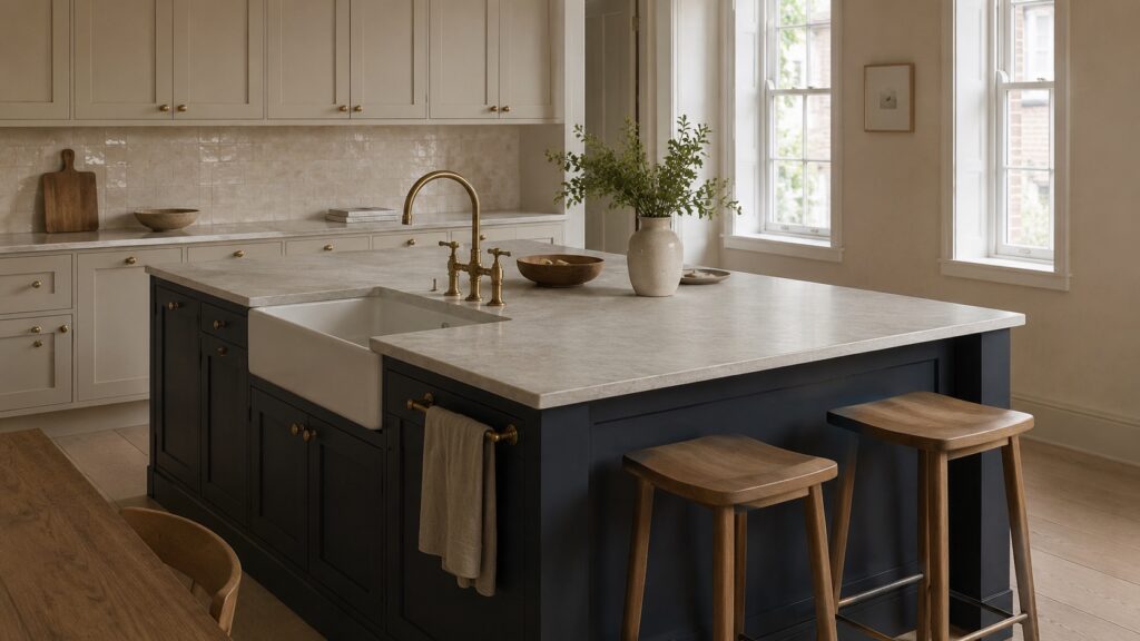
Taj Mahal quartzite reads warm, and that single trait drives every pairing decision. Its background is a creamy, soft white, and the veining moves through gold, honey, amber, and taupe. So build the palette from warm partners. Warm whites, creamy off-whites, beiges, greiges, natural wood, and warm metals like brass all sit comfortably beside it, while stark cool whites and cold grays tend to fight it.
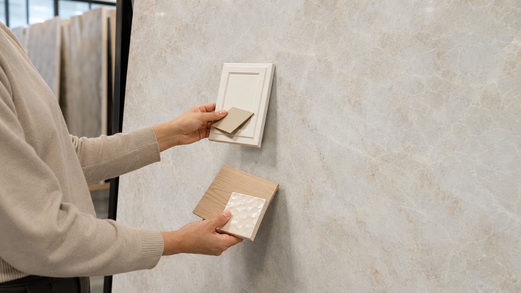
Elements Room carries Taj Mahal slabs at its Los Angeles and San Antonio showrooms, where you can hold cabinet and tile samples against a full slab. Below is the pairing approach most designers converge on, broken down by cabinet, backsplash, sink, hardware, wall, and floor.
What Is Taj Mahal Quartzite?
Taj Mahal is a natural quartzite quarried in Brazil, prized for a warm, creamy-white background and soft veining in gold, honey, amber, and taupe, sometimes with a faint pink-beige cast. That warmth is the whole reason it pairs the way it does, and it is why the stone reads as a cozy alternative to cool white quartz.
It is also built for real use. Taj Mahal quartzite registers about a 7 on the Mohs hardness scale, harder than marble and granite, so it resists scratching, etching, and heat, and shrugs off daily cooking, spills, and acidic foods. With basic sealing and routine cleaning it holds its look for years, which makes it as suited to a hard-working kitchen counter as to a statement island, a full-height backsplash, or a bathroom vanity.
The stone also comes in more than one finish. At Elements Room, Taj Mahal is available Polished (bright and reflective, with the veining at its boldest), Honed (a soft, low-sheen matte), and Leathered (a subtly textured finish), so you can tune how much the gold veining pops before you even choose a paint color.
All of which comes back to one thing for pairing: the undertone is warm. That is the starting point for every choice below.
It also explains the stone’s momentum. Good Housekeeping reports that designers are moving toward quartzite for the elegance of marble without the upkeep, and color consultant Maria Killam has singled out Taj Mahal specifically as the trending countertop for 2026, pointing to exactly those taupe and pink-beige undertones.
Cabinet Colors That Work with Taj Mahal Quartzite
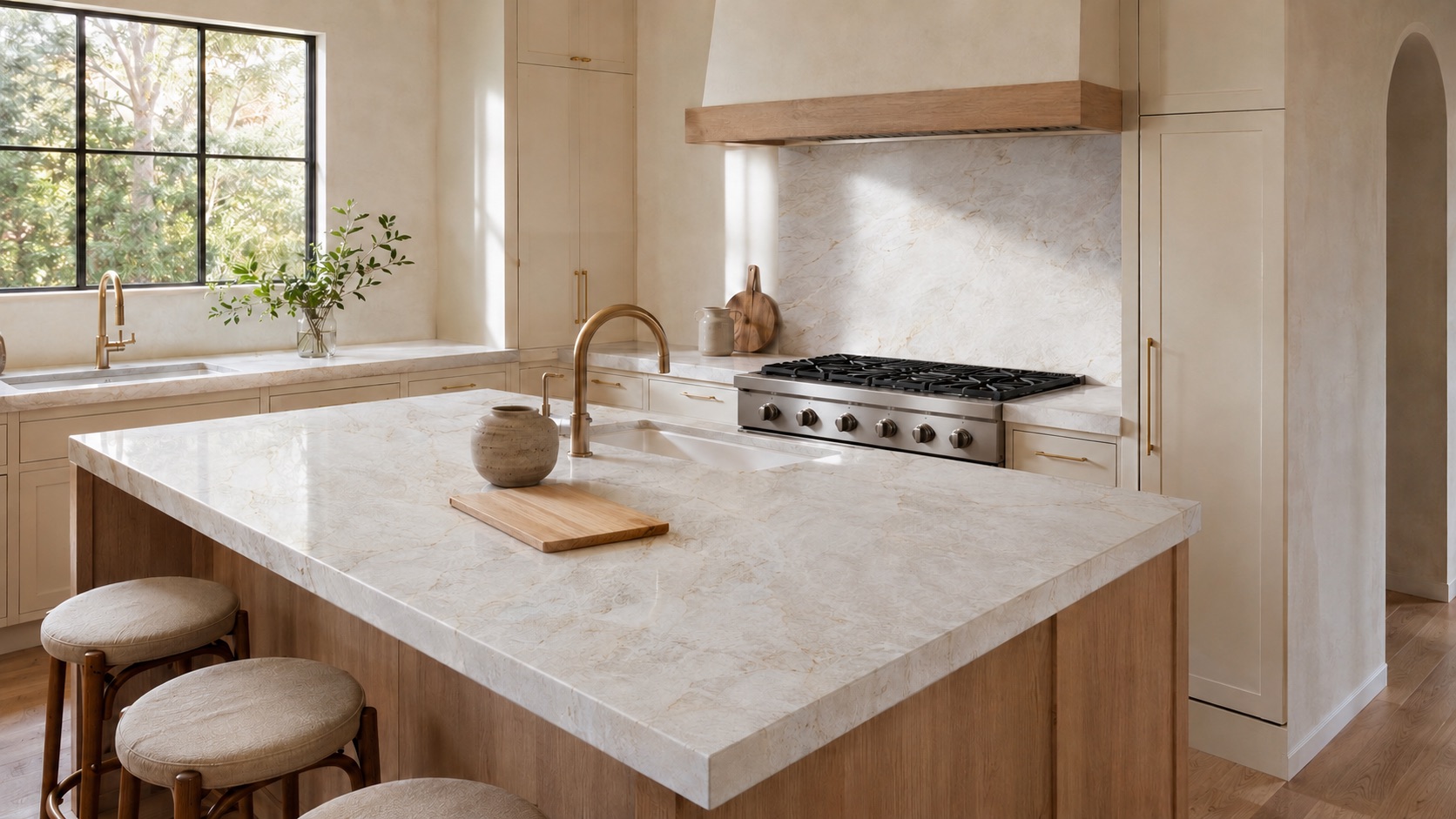
Cabinets are the largest color block, so start here. These pairings reflect broad designer consensus, with temperature as the deciding factor.
-
Warm white and cream: The most reliable pairing. A creamy white echoes the stone’s base and lets the gold veining lead. Avoid stark, cool-white paint, which can make the counter look yellow by contrast.
-
Greige: A warm greige links the taupe veins to the walls. It works well, though it is slab-dependent, so sample against your specific slab before committing.
-
Beige: Because of the stone’s taupe-beige marbling and amber-gold veining, well-chosen warm beiges are a natural fit.
-
Natural wood: Wood grain shares the stone’s warmth, so white oak or walnut cabinets feel almost inevitable beside it.
-
Navy for the island: As a contrast move, a warm, grayed navy grounds the palette while the counter stays the star. Keep it off a cold cobalt.
Green cabinets are a popular 2026 look, and a warm gray-green can work here, but treat it as design opinion rather than a rule.
Backsplash Pairings
You have two honest directions: disappear the backsplash into the counter, or use a warm, simple tile.
-
Full-height slab: Running the same Taj Mahal slab up the wall gives a seamless look with no grout lines. It is one of the most requested luxury backsplash options for a reason, and it puts the quartzite’s veining front and center.
-
Warm, simple tile: A warmer, simpler tile is more compatible with Taj Mahal than a busy or cool one. Zellige and subway, in warm or creamy tones, fit that brief.
Sink and Hardware
Small surfaces set the finishing tone.
-
Warm metals for hardware. Brass, unlacquered brass, and aged bronze pick up the stone’s amber-gold veining better than any other metal. This is the strongest hardware pairing.
-
Fireclay apron sink: A warm-white fireclay farmhouse sink reinforces the stone’s soft glow.
-
Stainless, undermount:. A neutral default that lets the counter carry the room.
-
Matte black accents: Used sparingly, matte black grounds the warm palette with graphic contrast.
Wall Paint and Flooring
For walls, stay in the warm neutral lane: warm off-whites, subtle beiges, and light taupes hold hands with the counter, while cool grays tend to flatten its warmth. If you want a warm neutral with a name behind it, Sherwin-Williams named Universal Khaki its 2026 Color of the Year, a warm, nature-inspired neutral that suits the stone’s palette.
For flooring, warm wood tones (white oak, honey, or a soft walnut) are the surest match. If you prefer stone or porcelain floors, warm beige or greige reads better than a cool concrete gray. Flooring pairings here are design opinion. The guiding principle throughout is temperature agreement, top to bottom.
Sample Before You Commit
Because every Taj Mahal slab differs, the counter, not a photo, should set the palette. The same stone reads honey-gold in a south-facing kitchen and soft taupe in a north-facing one, and paint chips shift beside it. Never commit to a single sample; compare two or three near-options side by side under your actual light.
Both Elements Room showrooms, in Los Angeles and San Antonio, keep current Taj Mahal slabs on display, so you can hold your cabinet and tile samples against the real stone.